BI Data Visualization: How to Build Reports People Can Act On
⏲ Read time: 6 minutes

Power BI data visualization is not just about choosing a chart. It is about helping people understand what matters, compare alternatives and make better decisions.
Power BI helps teams create reports, dashboards and analytical views from business data. But a report can be technically correct and still fail if the user cannot understand what to do next. This is especially important when Power BI reports are shared beyond the analytics team, for example with customers, partners, suppliers, regional managers or wider internal teams.
Good Power BI data visualization helps users understand the data. Good Power BI distribution helps the right users act on it.
What Power BI Data Visualization Means
Power BI data visualization is the process of turning data into visual reports that users can read, explore and act on. This can include bar charts, line charts, KPI cards, tables, matrices, scatter plots, maps and slicers.
But the visual is only the visible layer. A useful Power BI report also depends on clear measures, consistent definitions, reliable data models and the right access logic. A clean revenue chart is not useful if users do not know whether revenue includes discounts, returns or tax.
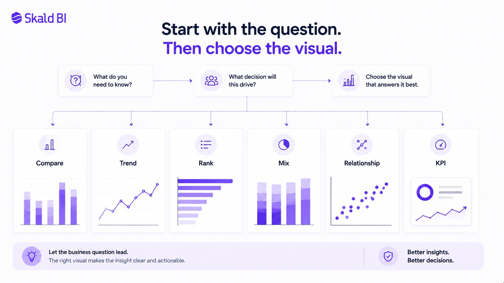
For decision-makers, the first question should not be “Which visual looks best?” It should be “What business question should this visual answer?”
Start With the Message, Not the Chart Type
A common reporting mistake is to start with the chart type. A stronger approach is to start with the message.
Before building a Power BI visualization, define what the user needs to understand. Is the user comparing regions? Tracking revenue over time? Identifying underperforming accounts? Explaining margin pressure? Monitoring customer satisfaction?
The chart should support one clear analytical task:
| Analytical intent | Better visual | Use when |
|---|---|---|
| Compare categories | Bar chart | Comparing regions, products, teams or customers |
| Show change over time | Line chart | Tracking revenue, NPS, delivery times or retention |
| Show part of total | Stacked bar | Showing mix by segment, channel or product group |
| Show ranking | Sorted bar chart | Showing top customers, markets or issue areas |
| Show relationship | Scatter plot | Comparing usage, cost, satisfaction or churn risk |
| Show KPI performance | KPI card with context | Showing current value, target, variance and trend |
This logic is simple but often missed. If the purpose is comparison, use a visual that makes comparison easy. If the purpose is trend analysis, make time the main structure. If the purpose is prioritization, sort by importance rather than alphabetically.
The strongest Power BI reports feel obvious to the reader. Not because the analysis is simple, but because the report designer has made the analytical choice clear.
Choosing the Right Power BI Visualization for the Business Question
Power BI data visualization is not mainly about using advanced visuals. It is about matching the visual to the decision the report needs to support.
A sales director comparing markets needs a different view from a CFO tracking margin development. A customer success team monitoring account health needs a different view from an executive team reviewing monthly performance.
Practical examples:
| Scenario | Better Power BI visualization | Why |
|---|---|---|
| Customer satisfaction by market | Sorted bar chart | Makes market differences easy to compare |
| Revenue over 24 months | Line chart | Shows trend, seasonality and changes |
| Support tickets by category | Bar chart or Pareto-style view | Helps prioritize the largest issue areas |
| Revenue by segment and year | Stacked bar or small multiples | Shows both total change and mix shift |
| Usage versus churn risk | Scatter plot | Helps identify abnormal account patterns |
| Executive monthly performance | KPI cards plus trend lines | Combines current status with direction |
The title also matters. A weak title says “Sales by region.” A stronger title says “Nordic sales growth is concentrated in Sweden and Denmark.” The first title describes the object. The second tells the reader what to notice.
This becomes more important when reports are shared outside the core analytics team. Customers, partners and broader internal audiences may not understand the underlying data model, workspace structure or metric definitions. They need reports that are visually clear, logically structured and easy to access in the right context.
Power BI helps teams build the report. Skald BI becomes relevant when those reports need to be shared securely through a branded portal with the right access for the right audience, according to the supplied Skald BI brief.
Core Principles for Better Power BI Data Visualization
Clear Power BI reporting depends on discipline. The best reports usually remove more than they add. They make the important comparison visible, reduce unnecessary decoration and give the user enough context to interpret the number correctly.
Use these rules when designing Power BI visuals:
- One chart, one message. If the chart supports two different conclusions, split it.
- Use direct labels where possible. Do not force users to decode legends if labels can sit next to lines or bars.
- Sort charts by meaning. Rank descending for comparisons and chronological for trends.
- Use restrained color. Most elements should stay neutral. Use accent color to guide attention.
- Add business context. Show target, benchmark, prior period or peer comparison when it changes interpretation.
These rules are not about making reports look like consulting slides. They are about reducing the risk of misinterpretation. Honest scales, clear labels, restrained gridlines and selective callouts make a chart easier to understand and harder to misuse.
The real test is whether the visual helps someone decide, prioritize or ask a sharper question. If it does not, it may be visually polished but analytically weak.
Designing Power BI Reports for Different Audiences
Not every user needs the same report. A CEO, sales manager, partner, customer success lead and external customer may all use the same underlying data, but they do not need the same level of detail.
Executive users usually need fewer visuals, stronger context and clearer variance against targets. Operational users often need filters, drill-down paths and exception views. External customers need clarity, trust and a controlled experience.
This creates a reporting design challenge. If the report is too detailed, senior users stop reading. If it is too summarized, operational users cannot act. If it exposes too much structure, external users may see information that is irrelevant or confusing.
A practical Power BI approach is to separate report pages by user task. One page can provide the executive overview. Another can show operational drivers. A third can support account-level follow-up.
When reports are distributed through a portal, the audience layer becomes even more important. The question is not only what the report shows. It is also who can access it, how they find it and whether the experience feels appropriate for the brand relationship.
Where Skald BI Fits Around Power BI
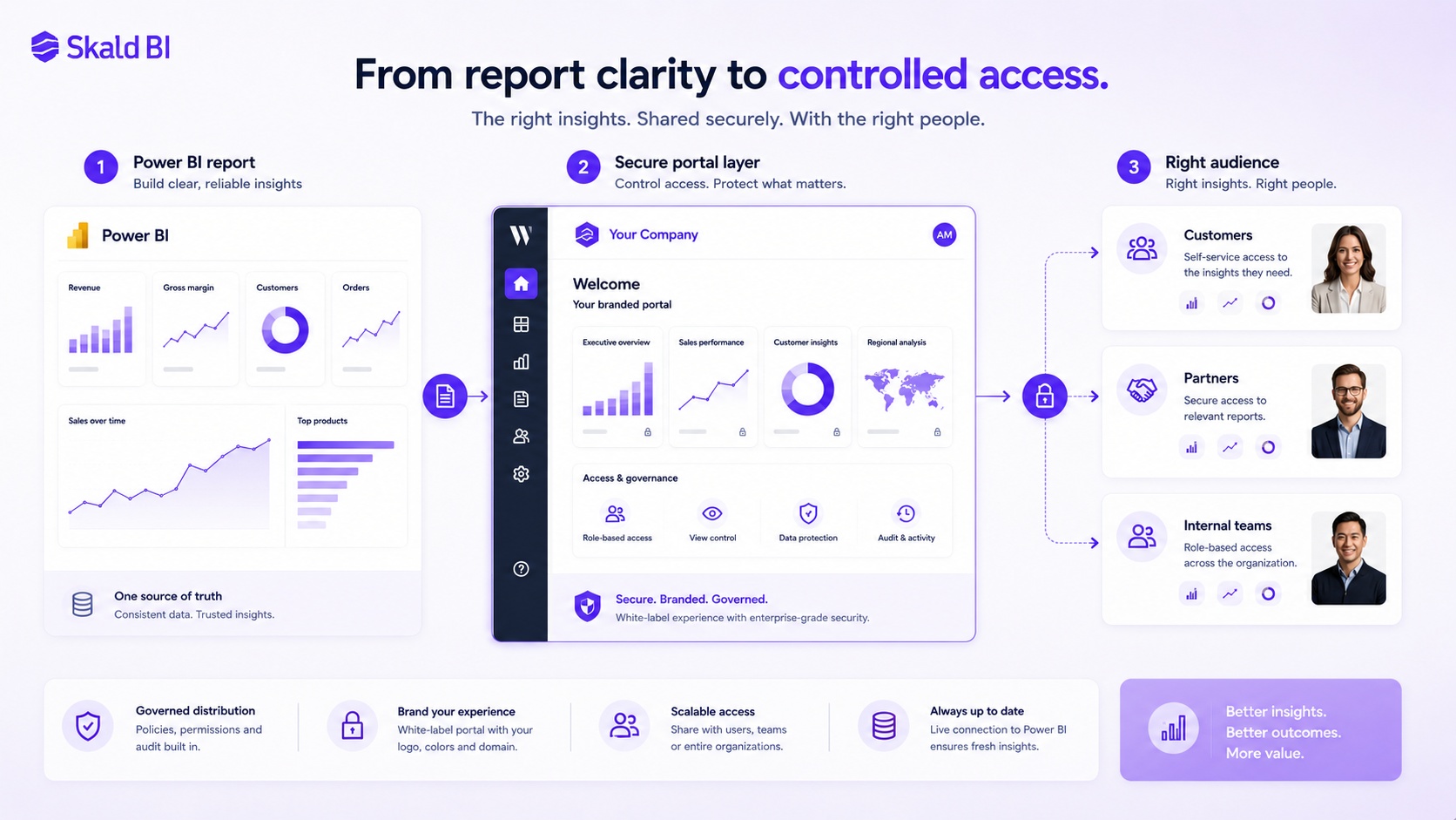
Skald BI is relevant when an organization already uses Power BI and wants to share existing reports more securely, clearly and professionally with the right audiences.
The important point is that Skald BI does not replace Power BI. Power BI remains the tool teams use to create reports. Skald BI adds a secure and branded portal layer around existing Power BI reports, with a focus on access, rights, branding, cost control and simpler distribution, according to the supplied brief.
This is especially relevant when reports need to be shared with customers, partners, external stakeholders or larger internal user groups. In those cases, the challenge is not only report design. It is also access, governance, presentation and scale.
The value is not “better charts because of another tool.” The value is that strong Power BI reports become easier to share with the right people in the right context.
Conclusion: Better Visualization, Better Distribution
Power BI data visualization is at its best when every visual supports a clear business question. The goal is not to show as much data as possible. The goal is to help users compare, track, prioritize, understand and act.
Power BI helps teams create reports. Skald BI helps teams share existing Power BI reports through a secure, branded portal when the audience extends beyond the workspace.
Ready to share Power BI beyond your workspace? Book a demo with Skald BI and see how your existing Power BI reports can be shared through a secure branded portal.
Table of contents
- What Power BI Data Visualization Means
- Start With the Message, Not the Chart Type
- Choosing the Right Power BI Visualization for the Business Question
- Core Principles for Better Power BI Data Visualization
- Designing Power BI Reports for Different Audiences
- Where Skald BI Fits Around Power BI
- Conclusion: Better Visualization, Better Distribution

About the author
David Glassel
David Glassel is a Senior Partner and Consultant at Wahsel, helping companies use strategy, AI, analytics and technology to drive the CEO agenda and create measurable business impact. He has held Head of Business Development roles at Saint-Gobain Distribution Sweden and Stadium, as well as technology leadership roles at H&M Group, including Head of Business Tech EMEA and Head of Store Solutions.
LinkedIn
Related articles

Power BI Dashboard Examples: Practical Ideas for Business Teams
Practical Power BI dashboard examples for executives, customers, partners and internal teams, with guidance on secure report sharing.
Read more
Power BI Portal: How to Share Reports Securely Beyond the Workspace
Learn what a Power BI portal is, when it is useful, and how to share Power BI reports securely with customers, partners and teams.
Read more
What is Power BI? A practical guide for teams that need better reporting and better sharing
Learn what Power BI is, how it works and why sharing reports with customers, partners or teams often requires a better portal layer.
Read more