Power BI Dashboard Examples: Practical Ideas for Business Teams
⏲ Read time: 10 minutes

Power BI dashboard examples are useful because most teams do not start with a technical question. They start with a business question.
Which customers are at risk? Are sales behind target? Where are costs moving faster than revenue? Which suppliers, regions or teams need attention? A good Power BI dashboard helps answer these questions quickly, without forcing users to search through spreadsheets, systems or disconnected reports.
Power BI is well suited for building reports and dashboards around business data. But the value of a dashboard is not only in how it looks. The value comes from how clearly it supports decisions, how easily the right people can access it, and how well it fits into the way the organization works.
This article gives practical Power BI dashboard examples for different business contexts. It also explains why sharing, access control, branding and governance become important when dashboards are used beyond the core analytics team.
What Is a Power BI Dashboard?
In Power BI, a dashboard is typically a single-page view in the Power BI service that brings together visuals, tiles and key information. It is designed to give users a quick overview of important metrics. A report, by comparison, can contain multiple pages and deeper analysis.
This distinction matters. Many people search for “Power BI dashboard examples” when they are really looking for report ideas, executive views, KPI pages or customer-facing analytics experiences. In practice, organizations often use a combination of Power BI reports and dashboard-like pages to serve different audiences.
A dashboard should not try to answer every possible question. It should help the user understand status, spot exceptions and know where to go next. Good dashboard design starts with the audience, not the visual layout.
What Makes a Good Power BI Dashboard?
A good Power BI dashboard is specific. It is built around a defined user group, a clear business process and a small number of decisions. A dashboard for a CFO should not look like a dashboard for a warehouse manager. A dashboard for customers should not expose the same level of detail as an internal management report.
A practical dashboard should usually answer five questions:
- What is happening now?
- How does performance compare with target, budget or previous period?
- Where are the main deviations?
- Which users or teams need to act?
- Can the viewer trust that they are seeing the right data for their role?
The last question is often overlooked. Once reports move beyond a small internal group, access and governance become part of the user experience. A dashboard is only useful if the right person can find it, open it and understand what they are allowed to see.
Executive Power BI Dashboard Example
An executive dashboard should give a concise view of business performance. The audience is usually the CEO, CFO, management team or board. These users do not need every operational detail on the first page. They need a clear view of direction, risk and exceptions.
A typical executive Power BI dashboard might include revenue, gross margin, cash position, forecast accuracy, customer concentration, sales pipeline and major operational KPIs. The structure should follow the way the business is managed. For a SaaS company, that may include ARR, churn, net revenue retention and customer acquisition cost. For a retail company, it may include sales, margin, inventory, conversion and campaign performance.
The dashboard should separate signal from noise. Trend lines, variance to target and exception indicators are often more useful than large tables. Executives need to understand whether performance is ahead, behind or changing faster than expected.
For executive reporting, distribution is also important. If the dashboard is used in board meetings, management reviews or investor discussions, the organization needs clear control over who can access it. This is where many teams start to think beyond dashboard creation. Power BI helps the team build the report. A portal layer such as Skald BI can be relevant when the same reporting experience needs to be shared in a more controlled, branded and scalable way.
Sales Performance Dashboard Example
A sales dashboard should connect commercial activity to revenue outcomes. It should not only show booked sales. It should help sales leaders understand pipeline quality, conversion, forecast risk and where coaching or management attention is needed.
A practical sales Power BI dashboard can show pipeline by stage, expected close date, win rate, average deal size, sales cycle length, quota attainment and forecast versus target. For account-based B2B sales, it can also include customer segment, industry, region, owner and next action.
Sales dashboards are often shared with different groups. Management may need the full view. Sales reps may need only their own accounts. Partners or distributors may need a filtered view of their territory. In those cases, access control and role-based visibility become part of the design, not an afterthought.
Finance Dashboard Example
A finance dashboard should create confidence in the numbers. It is less about visual complexity and more about clarity, consistency and traceability.
Common finance dashboard elements include revenue, cost, gross margin, operating profit, cash flow, working capital, overdue receivables, budget variance and forecast updates. The dashboard should make it easy to move from overview to explanation. For example, a CFO may want to see that margin is down, then understand whether the driver is price, volume, mix, discounts, supplier cost or currency.
Finance dashboards often require careful definitions. Revenue recognition, cost allocation, currency conversion and period cutoffs must be handled consistently. If business users do not trust the numbers, design will not fix the problem.
Balanced KPI Dashboard Example
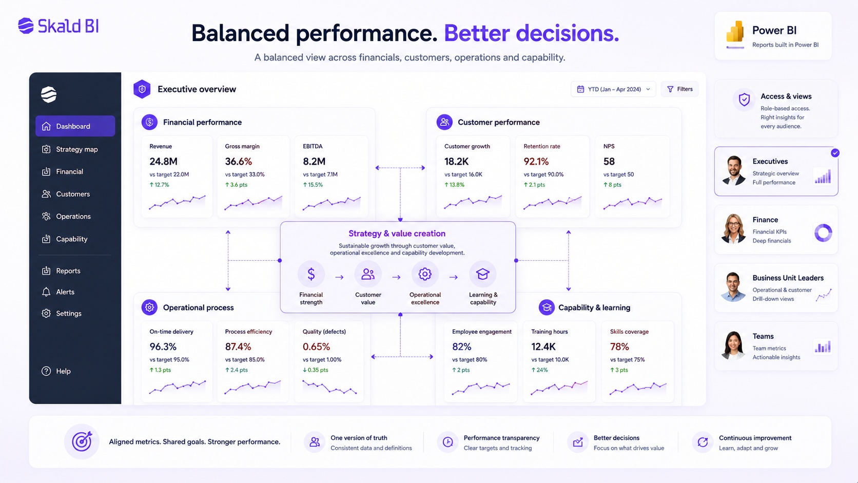
A balanced KPI dashboard can help leadership teams look beyond one narrow performance area. Instead of showing only financial results, it can combine financial performance, customer outcomes, operational process metrics and capability indicators.
This type of dashboard is useful when the business wants to connect strategy to execution. Revenue and margin may show the outcome, but customer satisfaction, delivery quality, employee capability or product adoption may explain where future performance is heading.
The risk is that balanced dashboards become too broad. If every function adds its own metric, the dashboard loses focus. A strong version keeps the structure simple, uses a limited number of KPIs and connects each metric to a decision, owner or management review.
Customer Success Dashboard Example
A customer success dashboard is useful when a company needs to monitor customer health, product usage, renewal risk and account growth. It is especially relevant for SaaS, subscription services and recurring B2B relationships.
A good customer success dashboard may include active users, usage frequency, feature adoption, support tickets, customer satisfaction, renewal date, contract value, expansion potential and health score. The purpose is not only to measure customers. It is to help the customer success team prioritize action.
There is also an external version of this use case. Some companies want to give customers direct access to their own reporting. That can be valuable, but it changes the requirements. The experience must feel professional, access must be controlled, and customers should only see the data intended for them.
Customer-Facing Power BI Dashboard Example
A customer-facing dashboard is different from an internal dashboard. The viewer is outside the organization, which changes the expectations around access, design, language and trust.
Examples include performance reporting for clients, delivery status dashboards, service quality reports, survey results, usage analytics, partner sales reporting or financial reporting for customers. In these cases, the dashboard is part of the customer experience. It should feel intentional, not like an internal report that has been exposed externally.
Customer-facing dashboards should be simple, filtered and clearly branded. The user should know what they are looking at, which period the data covers and how to interpret the metrics. They should not need to understand the internal Power BI workspace structure.
This is also where governance becomes critical. External users should only access the reports and data intended for them. Depending on the setup, organizations may use Power BI sharing, Microsoft Entra B2B, embedded analytics or a separate portal approach. The right model depends on the audience, license context, data sensitivity and operational needs.
Skald BI is built for organizations that already use Power BI and want to share existing reports through a secure, branded portal. The point is not to replace Power BI. The point is to make distribution easier when reports need to reach customers, partners or larger user groups.
Partner and Supplier Dashboard Example
Partner and supplier dashboards help organizations share performance data across company boundaries. This can include sell-through reporting, stock levels, campaign results, delivery performance, service levels, compliance metrics or joint business planning KPIs.
The dashboard should focus on the relationship between the organizations. A supplier does not need internal management reporting. A reseller does not need the full sales model. A partner needs the information that helps them act within their role.
This creates a practical challenge. The same underlying Power BI reports or semantic models may support many partners, but each partner should only see the right data. Row-level security can help filter data at the row level when correctly designed, but organizations still need to think through the full access experience, user management and publishing model.
Dashboard Governance and Access Control
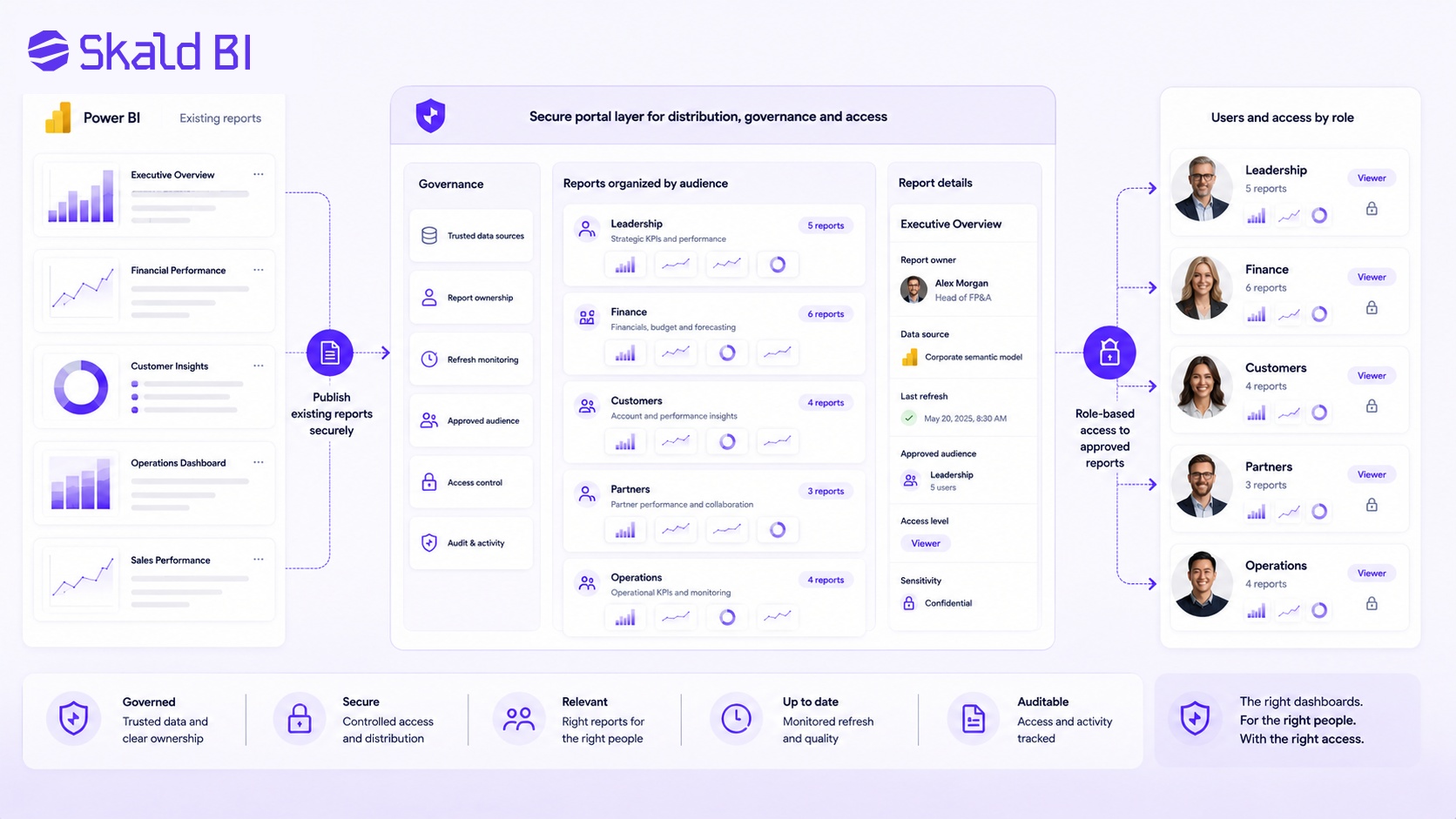
Many dashboard problems are not visual problems. They are governance problems. The report may look good, but users may not know whether the numbers are correct, who owns the definitions or whether they are allowed to share the information.
Governance becomes more important when dashboards are shared with many users or outside the organization. Teams need to define who owns the report, how data is refreshed, which users have access, which audiences are approved and how sensitive information is handled.
This does not mean every dashboard needs a heavy governance process. It means the level of control should match the risk and audience. A board dashboard, customer portal or partner reporting environment needs more discipline than an internal team dashboard used by a few people.
From Dashboard to Actionboard
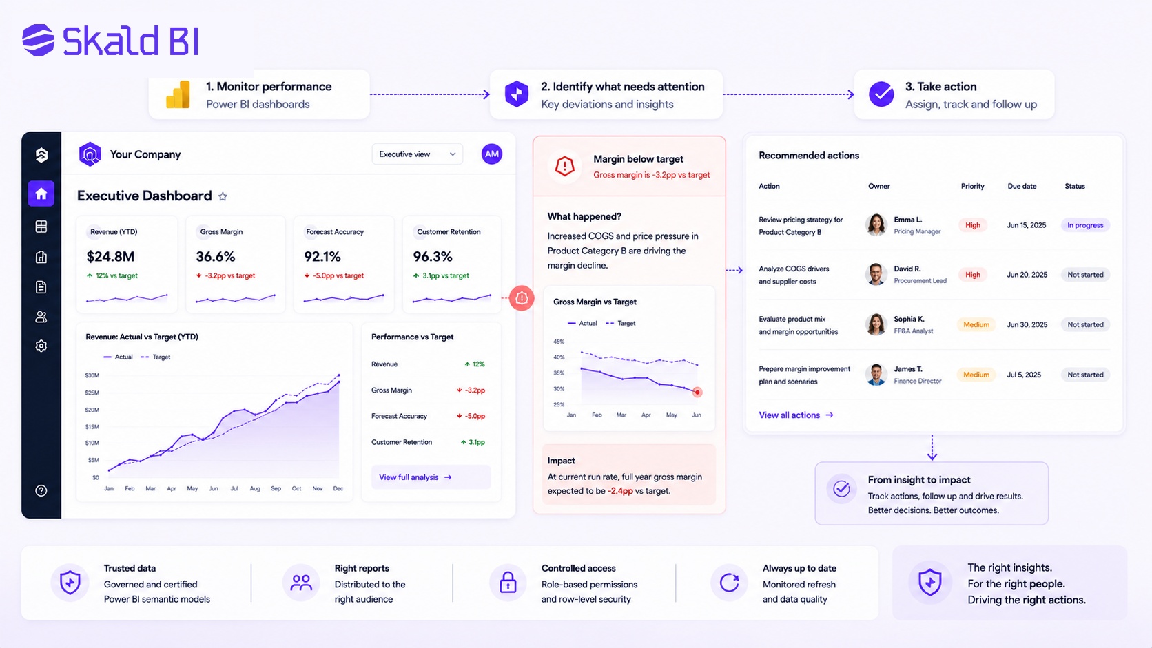
A dashboard that only displays data can still leave the user with the hardest question: what should we do now?
For many business teams, the next step is to connect dashboards more clearly to actions. That might mean showing exceptions, assigning owners, tracking next steps or highlighting areas that need management attention. The dashboard becomes less of a static reporting page and more of a practical tool in the operating rhythm.
This is especially relevant for operations, sales, customer success and service delivery. A delayed delivery, declining usage trend, forecast risk or margin deviation should not only be visible. It should be easy to understand who needs to act and what the next step is.
Power BI Report Distribution Model
The most useful dashboard example is not always another dashboard. Sometimes it is the distribution model around the dashboard.
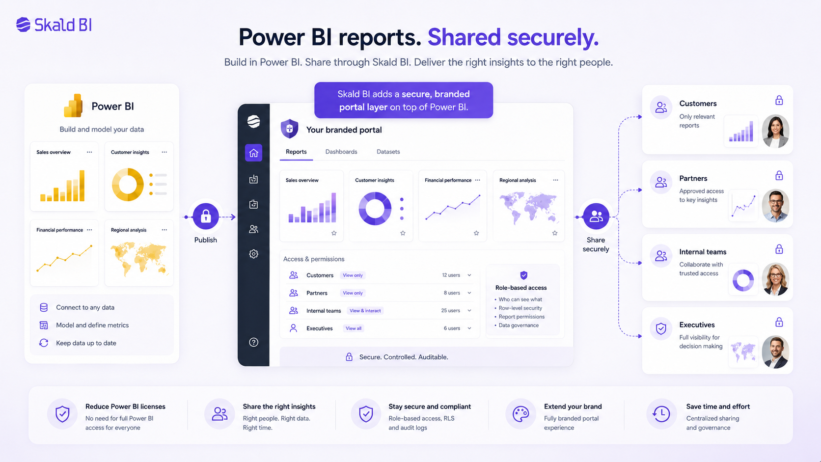
Power BI helps teams build reports. But when reports need to be shared with customers, partners, executives or large internal audiences, organizations also need to think about how users find the right reports, how access is controlled and how the experience is presented.
A simple model is to keep building reports in Power BI, then use a secure branded portal layer to distribute those reports to the right audiences. This avoids creating a parallel analytics stack while improving the reporting experience for users outside the core workspace.
That is the role Skald BI is designed to support. It adds a portal layer around existing Power BI reports so organizations can share them in a more controlled, branded and scalable way.
Power BI Dashboard Examples by Audience
The most useful way to choose dashboard examples is to start with the audience. A dashboard is not a static artifact. It is a decision support tool for a specific group of users.
An executive dashboard may need a small number of board-level KPIs. A manager dashboard may need team comparison and variance. An analyst report may need detail and drill-through. A customer dashboard may need simplicity, branding and strict access control. A partner dashboard may need controlled external distribution across many organizations.
Before building or redesigning a dashboard, define the dashboard logic clearly:
- Audience: who will use it and how often?
- Decision: what decision or action should it support?
- Data scope: what data should be included and excluded?
- Access: who is allowed to see which version?
- Distribution: where should users go to find and use it?
These questions are more important than choosing a visual theme. Design follows from the business use case.
When a Branded Power BI Portal Makes Sense
A branded portal is not necessary for every Power BI dashboard. If reports are only used by a small internal team, standard Power BI sharing may be enough. The need usually appears when reporting becomes part of a broader business process or customer experience.
A portal becomes more relevant when the organization needs to share reports with customers, partners, franchisees, suppliers, board members or a large internal population. It is also relevant when the reporting experience should match the company brand, reduce manual access work or make it easier for users to find the right reports.
The key point is that the portal should not create a parallel analytics stack. For many organizations, the efficient model is to keep building reports in Power BI and improve how those reports are distributed.
Skald BI is designed for that scenario. It supports the idea that Power BI is the reporting engine, while Skald BI acts as the sharing and portal layer for controlled distribution.
Ready to Share Power BI Beyond Your Workspace?
Power BI dashboard examples can help teams design better reporting, but the next question is often distribution. Who should see the report? How should they access it? What should the experience look like for customers, partners or larger internal teams?
If your organization already uses Power BI and wants to share existing reports through a secure branded portal, Skald BI can help.
Table of contents
- What Is a Power BI Dashboard?
- What Makes a Good Power BI Dashboard?
- Executive Power BI Dashboard Example
- Sales Performance Dashboard Example
- Finance Dashboard Example
- Balanced KPI Dashboard Example
- Customer Success Dashboard Example
- Customer-Facing Power BI Dashboard Example
- Partner and Supplier Dashboard Example
- Dashboard Governance and Access Control
- From Dashboard to Actionboard
- Power BI Report Distribution Model
- Power BI Dashboard Examples by Audience
- When a Branded Power BI Portal Makes Sense
- Ready to Share Power BI Beyond Your Workspace?

About the author
David Glassel
David Glassel is a Senior Partner and Consultant at Wahsel, helping companies use strategy, AI, analytics and technology to drive the CEO agenda and create measurable business impact. He has held Head of Business Development roles at Saint-Gobain Distribution Sweden and Stadium, as well as technology leadership roles at H&M Group, including Head of Business Tech EMEA and Head of Store Solutions.
LinkedIn
Related articles

What is Power BI? A practical guide for teams that need better reporting and better sharing
Learn what Power BI is, how it works and why sharing reports with customers, partners or teams often requires a better portal layer.
Read more
Power BI Portal: How to Share Reports Securely Beyond the Workspace
Learn what a Power BI portal is, when it is useful, and how to share Power BI reports securely with customers, partners and teams.
Read more
Power BI License: Costs, Sharing Rules, and Smarter Report Distribution
Understand Power BI license costs, sharing rules, external access, and how a secure portal can simplify report distribution.
Read more